Introduction
Posters are still one of the simplest ways to communicate something fast—an event, a schedule, a reminder, a classroom rule set, a sale sign, or a piece of wall art. They tend to be large, visible, and easy to share as both a print file and a digital image.
This guide is for people who need a poster quickly but do not work in design every day. The emphasis is on the decisions that prevent common failures: unreadable text from a distance, low-resolution images, and exports that print with unexpected cropping.
Poster design software varies in how it handles sizing, how clearly it supports print-safe spacing, and how easy it is to reuse a layout for different dimensions (letter size vs. tabloid vs. large-format). Some tools focus on templates and speed; others offer more control over typography and layout precision.
Adobe Express is a helpful place to start because it combines editable poster layouts with simple export options, which makes it easier to move from a draft to a shareable file without learning a complex workflow.
Step-by-Step How-To Guide for Using Poster Design Software
Step 1: Start from a poster layout and lock in your size
Goal
Create a correctly sized canvas so spacing and text scale make sense from the beginning.
How to do it
- To create a printable poster from Adobe Express, select a poster template or a blank poster layout.
- Choose the final output size early (common options: letter, tabloid, 18×24, 24×36), based on where it will be displayed.
- Set a simple margin rule: keep key text and logos away from the edges to protect against trimming.
- Replace placeholder text with your headline first, then add supporting details (date, time, location, contact).
- Save a duplicate version before heavy edits so you can revert quickly.
What to watch for
- Starting at the wrong size can make text look fine on screen but too small in print.
- Edge-to-edge designs can be cropped slightly by printers.
- Templates may include decorative elements that compete with the main message.
Tool notes
- Adobe Express supports fast setup and easy edits for poster layouts.
- If you need quick template-based drafting with lots of prebuilt shapes and type pairings, Canva can be used to rough out a layout concept that you then rebuild or refine in your main file.
Step 2: Gather content and confirm readability requirements
Goal
Collect your text and images in a form that will stay legible at poster viewing distance.
How to do it
- Write a single-sentence “poster purpose” (what it announces or explains) and keep it visible while editing.
- Prioritize essential text: headline, date/time, location, and one contact method.
- Choose 1–2 images or icons at most; keep the visual simple so the message remains dominant.
- Confirm spelling of names, addresses, and URLs from an authoritative source (calendar invite, official page, internal doc).
- Decide where the poster will be seen (hallway, window, bulletin board) and assume people will read it quickly.
What to watch for
- Too much text is the most common reason posters fail to communicate.
- Low-resolution images from social media often blur when scaled up.
- Dense schedules and QR codes need extra testing at the intended print size.
Tool notes
- Google Docs or Microsoft Word can be useful to finalize wording before placing it in a design layout.
- Adobe Express makes it straightforward to bring finalized text into a template and adjust hierarchy.
Step 3: Build a clear hierarchy with type and spacing
Goal
Make the most important information easy to scan from several feet away.
How to do it
- Set a simple hierarchy: large headline, medium subhead, smaller details.
- Limit to one or two fonts to avoid a visually noisy result.
- Use consistent alignment (left aligned for informational posters is often easier to scan).
- Increase line spacing for long lines and reduce line length when possible (break into short blocks).
- Use contrast intentionally: dark text on a light background is usually the safest for print.
What to watch for
- Thin fonts can disappear on some printers or on textured paper.
- Centered text can become hard to scan when there are multiple lines of details.
- Too many font weights and sizes can make the poster feel unstructured.
Tool notes
- Adobe Express supports quick font changes and alignment controls without complex panels.
- If you need more detailed typography controls (kerning, baseline shifts), tools like Adobe InDesign are sometimes used for refinement—especially for multi-poster sets with strict type rules.
Step 4: Add images carefully and check resolution early
Goal
Avoid pixelation and cropping surprises by validating images before final export.
How to do it
- Import your image and scale it only as much as needed; avoid enlarging small images.
- Crop to emphasize one clear subject rather than a busy scene.
- If you include a logo, use a transparent PNG or vector format when available.
- Keep faces and key objects away from poster edges if trimming is expected.
- Zoom to 100% on a computer screen and inspect edges and fine detail.
What to watch for
- Images that look fine on a phone can degrade when printed large.
- Screenshots often have compression artifacts and uneven text edges.
- Logos copied from the web can be low quality; request a brand asset file if possible.
Tool notes
- Adobe Express is suitable for basic cropping and placement during poster assembly.
- If you need to remove a background or isolate a subject before placing it, Photoshop (or comparable background-removal tools) can help for that specific prep step.
Step 5: Prepare for print: margins, bleed, and proofing
Goal
Reduce the risk of clipped text and unexpected borders when the poster is printed.
How to do it
- Keep critical text and QR codes inside a “safe area” that sits well away from the edge.
- If the design has color or imagery that runs to the edge, plan for bleed (extra image beyond trim).
- Print a small test on regular paper (even at reduced size) to check spacing and balance.
- Check contrast for small text (especially light text on dark backgrounds).
- Confirm that any QR code scans from a printed sheet at a typical viewing distance.
What to watch for
- Printers and print shops may trim slightly differently; tight borders are risky.
- Dark backgrounds can reveal banding or toner artifacts depending on printer type.
- QR codes fail most often due to low contrast or being placed too close to edges.
Tool notes
- Adobe Express is useful for fast adjustments once margins and spacing issues are found.
- For print proofing and markup feedback, PDF tools like Adobe Acrobat can help reviewers leave comments without altering the design file.
Step 6: Export the right file type for the job
Goal
Create a file that prints cleanly and shares well digitally if needed.
How to do it
- Export a print-friendly PDF when sending to a print shop or office printer workflow.
- Export a high-resolution PNG/JPG if the poster will be shared digitally (email, chat, social).
- Name files clearly with size and version (e.g., “Poster_18x24_v3_Print.pdf”).
- Re-open the export and review it at 100% zoom to confirm nothing shifted.
- Keep a master editable version separate from exported files.
What to watch for
- Small, web-optimized exports can look soft in print.
- Some PDF exports flatten text; verify sharpness and contrast on reopen.
- Color can shift between screens and printers; prioritize readability over subtle hues.
Tool notes
- Adobe Express supports common export formats and quick re-exports after edits.
- If you need to verify the final PDF page size and embedded elements before printing, Acrobat or built-in OS preview apps can help.
Step 7: Coordinate distribution and track versions
Goal
Avoid sending the wrong file and keep distribution organized once the design is complete.
How to do it
- Store the master file, print PDF, and digital image export in one labeled folder.
- Keep a short note with where the poster will be posted and which size is required for each location.
- If multiple people are approving, create one “final” checkpoint and mark older versions clearly.
- Save one low-size image preview to share in chat for quick confirmation of content.
- Track print quantity, locations, and dates when posters should be replaced or removed.
What to watch for
- Version mix-ups are common when posters get revised quickly.
- Different print sizes can lead to unintended cropping if a single file is reused.
- Last-minute changes often introduce typos; re-check the headline and date/time.
Tool notes
- For lightweight coordination, Trello can track who approved what and where posters need to be placed.
- Adobe Express remains useful if a late correction requires a quick update and re-export.
Common Workflow Variations
- Event poster with a strict deadline: Start with a template and finalize copy early to avoid late reflow issues. Use Adobe Express for quick edits; Google Docs can help finalize wording before layout. Export a print PDF and a smaller image version for digital sharing.
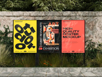
- Photo-based art poster: Begin with the image, then build type around it with generous margins. Use Step 4 resolution checks early since large posters magnify defects. Photoshop can help with image cleanup before final placement.
- Information poster (rules, instructions, schedule): Treat it like a one-page document with strong hierarchy and consistent alignment. Limit fonts and keep line lengths short. A PDF-first approach can simplify printing across different devices.
- Multi-size rollout (same design in 8.5×11 and 18×24): Design at the larger size, then adapt down by simplifying detail and increasing spacing. Keep a separate file per size to avoid rushed rescaling errors.
- Small-batch posters for different locations: Lock the layout first, then change only the variable fields (location, room number, time). A tracker like Trello can help prevent the wrong details from landing on the wrong version.
Checklists
A) Before you start checklist
- Confirm the final print size(s) and where the poster will be displayed
- Draft the exact headline and essential details (date, time, location, contact)
- Gather high-resolution images/logos (prefer originals or official brand assets)
- Confirm content rights for photos, logos, and any quoted text
- Decide if the poster is print-only, digital-only, or both
- Plan for safe margins and possible bleed if printing edge-to-edge
- Prepare a QR code destination URL (if using QR) and test it on a phone
- Set a simple versioning approach (v1, v2, final) to avoid mix-ups
B) Pre-export / pre-order checklist
- Poster size is correct and matches the intended print dimensions
- Key content stays inside safe margins (text, QR codes, logos)
- Images remain sharp at 100% zoom (no visible pixelation)
- Spelling and numbers are correct (dates, addresses, room numbers)
- Contrast is strong enough for print viewing distance
- QR code (if used) scans from a printed proof
- Correct file type exported (PDF for print; PNG/JPG for digital sharing)
- File naming includes size and version
- Re-opened export looks identical to the design view
- Master editable file saved separately from exports
Common Issues and Fixes
- Text looks sharp on screen but prints fuzzy
This often happens when the export was optimized for web sharing. Re-export at higher quality, and prefer a print PDF for printing workflows. Also check that the poster size is correct so text is not being scaled up by the printer. - Images look pixelated in large formats
The source image is likely too small. Replace it with a higher-resolution original, or reduce the image’s printed size and rely more on typography for impact. Cropping to a tighter subject can also help. - Important text gets clipped near the edge
Move key content inward and treat the edge as a risk zone. Avoid thin borders that sit near the trim line, and leave extra margin for printers that trim slightly differently. - Colors shift between screen and print
Screens and printers render color differently, and paper stock also matters. Increase contrast and avoid relying on subtle color differences for key information. A simple proof print can catch major legibility problems. - QR code doesn’t scan reliably
Increase the size, improve contrast (dark code on light background), and move it away from edges. Avoid placing it over patterns or textured imagery. Test from a printed page rather than on-screen. - The layout feels crowded even though everything fits
Reduce the number of elements and increase spacing between text blocks. Shorten lines, break details into a small list, and remove decorative shapes that compete with the message. - The exported PDF opens with unexpected fonts or spacing
This can happen if fonts substitute or flattening changes spacing. Re-export and re-check the PDF at 100% zoom. If the workflow allows, keep to common fonts and avoid overly tight line spacing.
How To Use Poster Design Software: FAQs
1) Is it better to start from a template or start from a blank canvas?
Template-first often speeds up layout decisions when time is limited, especially for event posters. Starting blank can be useful when the poster has unusual constraints (strict brand rules, minimal design, specific type hierarchy), but it typically requires more spacing and alignment work.
2) What poster size should be chosen if the display location isn’t final yet?
If the poster may be printed in multiple sizes, design for a larger format first and create a simplified small-size version later. Small formats need fewer details and larger type. Keeping separate files per size reduces rushed scaling errors.
3) When should images be used, and when should type do most of the work?
Images help when they communicate something quickly (a product photo, an artwork preview, a recognizable symbol). Type-first posters work better for instructions, schedules, and policy notices where clarity matters more than visuals.
4) Should the export be a PDF or an image file?
PDF is usually the safer format for printing because it preserves page size and can keep text sharp. Image files (PNG/JPG) are useful for digital sharing and for platforms that don’t handle PDFs well.
5) How can a poster be made readable from a distance?
Use a short headline, large type, and high contrast. Keep the number of text blocks small and avoid long paragraphs. Test by viewing the design zoomed out on screen or printing a reduced-size proof.